

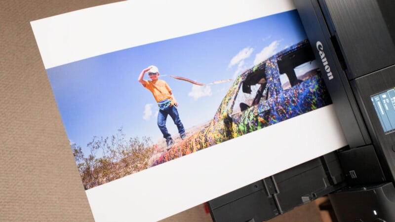
For many photographers, the transition from viewing an image on a high-resolution monitor to holding a physical print in their hands is fraught with frustration. In the early stages of a photographic career, bad prints are practically a rite of passage. Colors frequently come out looking completely wrong, tonal ranges fail to match what appeared on the screen, and the entire physical reproduction process can feel like an exercise in trial and error.
Yet, industry experts emphasize that the mechanics of fine art printing are not nearly as mysterious as they often seem. Achieving accurate, gallery-quality results ultimately comes down to understanding how a computer communicates digital data to a printer, mastering a handful of critical settings, and ensuring that the final output mirrors the photographer’s exact vision on the monitor.
The core challenge of fine art printing centers on a fundamental optical concept known as gamut—the complete range of colors that a specific device is capable of reproducing. While there is a substantial overlap between the color capabilities of modern monitors and professional inkjet printers, inherent physical differences remain between the two mediums. A monitor relies on an additive color system, projecting light directly from behind the screen into the viewer’s eyes to deliver exceptionally bright, vibrant colors. In contrast, printer ink operates on a subtractive color system, physically depositing pigments onto paper, meaning the final appearance of the image is heavily influenced by the ambient light under which it is viewed.
This is precisely where professional color management becomes essential. Color management does not magically bridge the physical gap between glowing pixels and dry paper; instead, it provides an accurate preview on the monitor, showing the photographer exactly what to expect from the paper once the ink dries.
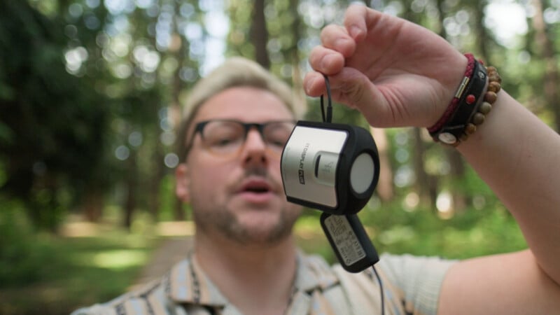
Regardless of how heavily an artist tweaks their editing software, hardware limitations also play a significant role in the final outcome. A dedicated professional photo monitor and a high-end photo printer will consistently outperform a standard gaming display and a basic consumer inkjet. However, specialized tools exist to eliminate much of the guesswork and standardize the preview process. A color calibrator, for example, measures and adjusts a monitor’s color output to a predetermined industry standard, bringing the creator significantly closer to true print colors even without investing in ultra-premium hardware.
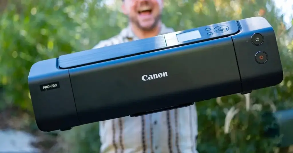
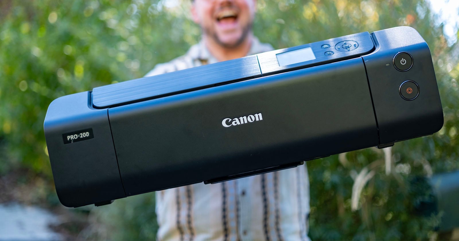
This workflow is universally applicable across various digital darkroom applications and printing hardware. Whether an artist utilizes raw processing software like Capture One and hardware such as the Canon PIXMA PRO-200, the underlying methodology remains completely consistent, even if specific menu items are located in different areas depending on the ecosystem.
When beginning a print job in an environment like Capture One with an image—such as a desert landscape captured on a medium-format camera in Joshua Tree—the first critical concept to grasp is the working color space. While standard web outputs typically rely on Adobe RGB or sRGB, advanced raw processors utilize expansive internal color spaces, meaning creators do not strictly need to select a final output color space until the export or print stage.
At the point of output, photographers must choose a specific color space represented by an ICC profile. Every device, from monitors to specific paper types, communicates using these profiles. If an image is assigned an Adobe RGB profile, the receiving device instantly recognizes the parameters of the color data it is processing.
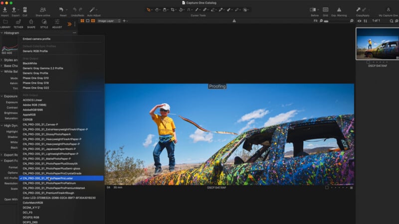
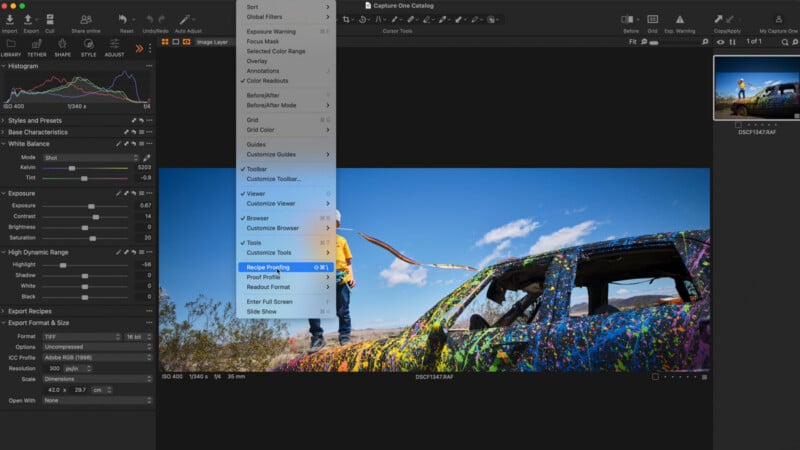
To prevent costly mistakes, professionals rely heavily on soft proofing. Soft proofing is the method by which editing software displays an accurate digital approximation of how an image will look when rendered on a specific physical medium or device. In software like Capture One, this feature can be toggled on to apply a distinct visual tag, ensuring that the photographer does not accidentally perform color grading under an unintended profile.
By switching between various ICC profiles designed for specific papers—such as choosing a standard lustre paper versus a traditional Japanese washi paper—the visual representation on the screen shifts dramatically. Washi paper, for instance, often yields a noticeably more desaturated look with softer, milkier blacks and shadows. Provided the monitor is properly calibrated, soft proofing offers an exceptionally reliable preview of the final physical artifact.
However, a common point of confusion arises at the exact moment of printing. Photographers do not actually embed these specific soft-proofing profiles directly into the final print command. Instead, telling the printer what specific paper is loaded—either through the software dialog or directly on the hardware’s onboard interface—dictates the final rendering. The primary responsibility of the software at print time is simply to hand off the most accessible, comprehensive color profile available, typically Adobe RGB or sRGB.
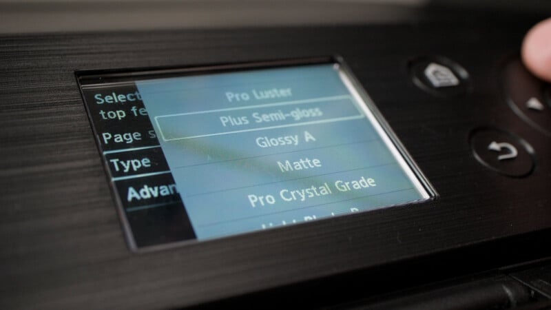
Printer hardware settings demand rigorous attention. Upon powering on the device, selecting the correct paper size and paper type is mandatory. On certain hardware models, this is configured entirely within the computer software, while on others, it must be inputted directly on the physical printer. This step is critical when the printer is left to manage color, as it ensures the software steps aside and allows the hardware to handle the necessary conversions seamlessly.
Even in workflows where the printer is not actively managing color, establishing the correct paper type remains vital. The printer relies on these dimensions and material specifications to calculate the precise amount of ink to deposit, a factor of paramount importance for borderless prints to prevent ink from spilling over the edges. Furthermore, different paper compositions feature varying degrees of porosity and require distinct levels of heat to properly cure and adhere the ink. Consequently, whichever system is designated to manage color, the user must always ensure the paper settings match the physical medium loaded into the tray.
Navigating the print dialog box presents another layer of technical decision-making, particularly regarding color management. Photographers generally face a binary choice: either let the printer manage the color conversion or let the software handle it. Under no circumstances should both systems attempt to manage color simultaneously. Selecting software management and designating a profile like Adobe RGB requires confirming that the printer’s internal color management is completely disabled, a step often reinforced by automated software warnings.
Operating systems handle this communication differently. macOS tends to streamline the process, preventing double-profiling by recognizing when the application is controlling the color and instructing the printer accordingly. Windows workstations, by contrast, frequently provide a wider array of manual configuration options at the printer driver level, which can inadvertently increase the risk of overlapping color management protocols if the user is not vigilant.
Regarding resolution, industry standards indicate that 300 dots per inch (dpi) is more than sufficient for high-quality photographic output. Escalating resolution settings to 600 or 1200 dpi generates microscopic details that the human eye cannot discern on a framed and hung photograph.
Sharpening presents another variable, operating independently of any sharpening applied during the initial digital editing phase. Leaving the printer-level sharpening at zero still yields fine detail, though the output can occasionally appear slightly softer than the on-screen rendition. Experts generally advise keeping this setting modest while experimenting to find the ideal balance for specific paper types.
Rendering intent offers four distinct mathematical approaches for handling colors that fall outside the printer’s physical gamut. Perceptual intent uniformly compresses the entire color spectrum so that it fits within the printable range, functioning much like a global contrast adjustment across the image. Relative colorimetric preserves all reproducible colors within the printable space while clipping those that exceed the gamut, yielding highly accurate tones but potentially introducing harsher transitions in the extreme highlights and shadows. Absolute colorimetric behaves similarly but preserves the native white point of the paper rather than shifting it to absolute white, allowing slightly warm or cool paper tones to retain their character. Finally, saturation intent prioritizes vivid, punchy colors over accurate skin tones. For most traditional photographic applications, perceptual intent remains the preferred choice because it maintains color relationships closest to what the creator observed on their monitor.
When evaluating internal print quality options within the driver settings, selecting a normal mode is typically sufficient. While "best" or maximum quality modes are available, they consume significantly larger quantities of expensive ink without producing a perceptible improvement in visual fidelity for most viewers, making the standard setting a more cost-effective choice for regular production.
By systematically locking in these settings, standardizing color profiles, and understanding the interaction between hardware and software, photographers can eliminate the historical guesswork of the darkroom. Whether printing fine art portfolios at home or preparing files for an external lab, establishing a disciplined color workflow ensures that the final physical print faithfully honors the digital image created on screen.